Dashboards Guide
Overview
What are Dashboards?
Dashboards provide real-time, visual views of shop floor performance, machine status, and KPIs.
Key Capabilities:
- Real-time monitoring: Live machine status and performance
- Visual KPIs: OEE, Utilization, Parts Goal at a glance
- Customizable views: Tailored to different roles and use cases
- Multi-display support: Desktop, tablet, and TV displays
- Data-driven decisions: Actionable insights from live data
Dashboard Types:
- Current Shift Dashboard: Real-time view of machines for current shift
- Performance Dashboard: Historical performance across days/shifts
- Machines List Dashboard: Tabular view with detailed metrics
- Timelines Dashboard: Interactive timeline of machine states
- Job Execution Dashboard: Real-time production order progress
- Daily Production Dashboard: Shop floor performance for daily meetings
- Tool Life Monitoring Dashboard: Track tool life and usage
- Configurable Dashboards: Custom dashboards with widgets
Who Uses Dashboards:
- Operations Managers: Monitor shift performance in real-time
- Machine Operators: View production goals and status at machines
- Maintenance Teams: Identify downtime patterns and alarms
- Production Planners: Track production order progress
- Plant Managers: High-level KPI monitoring on TV displays
- Executives: Strategic overview of plant/multi-plant performance
Dashboard Types
Quick Comparison
| Dashboard Type | Purpose | Best For | Display |
|---|---|---|---|
| Current Shift | Real-time machine status | Monitoring current shift | Desktop, TV |
| Performance | Historical comparisons | Shift/day comparisons | Desktop, TV |
| Machines List | Detailed tabular data | Sorting/filtering machines | Desktop |
| Timelines | Visual timeline of states | Downtime analysis | Desktop |
| Job Execution | Production order progress | Work order tracking | Desktop, Tablet |
| Daily Production | Daily meeting dashboard | Production meetings | Desktop, TV |
| Tool Life | Tool wear monitoring | Preventive maintenance | Desktop |
| Configurable | Custom widgets | Custom use cases | Desktop, TV |
Accessing Dashboards
Navigation:
- Click Dashboards in main sidebar
- Select dashboard type from menu:
- Current Shift
- Performance
- Machines List
- Timelines
- Job Execution
- Daily Production
- Tool Life Monitoring
- My Dashboards (Configurable)
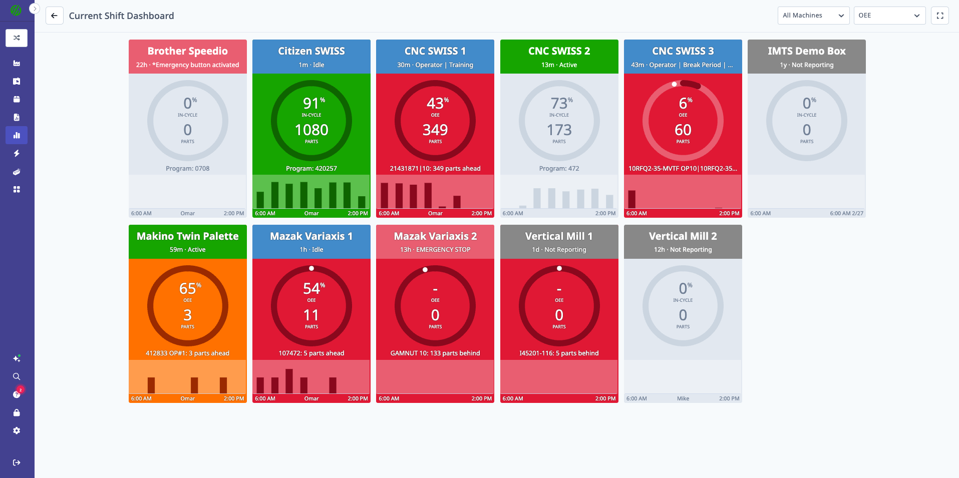
Current Shift Dashboard
What is Current Shift Dashboard?
Current Shift Dashboard provides a real-time view of all machines for the current shift.
Key Features:
- Machine tiles with live status (Active, Inactive, Disconnected)
- KPI selection: Parts Goal, OEE, or Utilization
- Hourly production/utilization charts
- Machine grouping and filtering
- Expanded view mode for TV displays
Dashboard Views
Three View Options:
- Parts Goal: Progress toward parts target
- OEE: Overall Equipment Effectiveness percentage
- Utilization: In-cycle time percentage
Switching Views:
- Click view selector dropdown (top right)
- Select desired view
- Dashboard updates immediately
Machine Tiles
Each Tile Shows:
- Machine Name
- Current Status: Active (green), Inactive (yellow), Disconnected (red)
- KPI Value: Based on selected view (Parts Goal %, OEE %, or Utilization %)
- Hourly Chart: Mini line chart showing last several hours
- Current Operation (if running)
- Operator Name (if logged in)
Tile Color Coding:
- Green: Meeting or exceeding target
- Yellow: Below target but not critically
- Red: Significantly below target
- Gray: No data or disconnected
Hourly Production/Utilization Charts
Chart Types:
- Parts Goal View: Parts produced per hour (bar chart)
- OEE View: OEE % per hour (line chart)
- Utilization View: Utilization % per hour (line chart)
Interactions:
- Hover over chart for details
- Click tile to open machine detail view
Filtering
Filter Options:
- Machine Group: View specific department or area
- Search: Find specific machine by name
Applying Filters:
- Click filter dropdown
- Select machine group(s)
- Dashboard updates to show only selected machines
Expanded View Mode
Purpose: Fill browser window for large screen projection (TV displays)
Activating:
- Click expansion arrows icon (bottom right)
- Dashboard expands to full browser window
- Tiles resize to fit screen
Exiting:
- Click collapse icon
- Or press Escape key
Use Cases
For Operations Managers:
- Monitor entire shift at a glance
- Identify underperforming machines
- Track progress toward production goals
For TV Displays:
- Shop floor visibility for all teams
- Real-time status for management walk-throughs
- Daily standup meeting backdrop
For Quick Check-Ins:
- Morning shift start review
- Mid-shift status check
- End-of-shift summary
Performance Dashboard
What is Performance Dashboard?
Performance Dashboard shows historical performance across days or shifts, comparing current vs. prior periods.
Key Features:
- Side-by-side comparison of current and previous periods
- Multiple view options (OEE, Parts Goal, Utilization)
- Machine grouping and filtering
- Trend identification (improving/declining performance)
- Expanded view mode for presentations
Dashboard Views
Three View Options:
- OEE: Overall Equipment Effectiveness by day/shift
- Parts Goal: Parts produced vs. target by day/shift
- Utilization: In-cycle percentage by day/shift
Performance Tiles
Each Tile Shows:
- Machine Name
- Current Period (today or current shift):
- KPI value (OEE %, Parts Goal %, or Utilization %)
- Visual indicator (color-coded)
- Previous Periods (preceding days or shifts):
- KPI values for comparison
- Trend arrows (up/down)
Example: OEE View (By Shift)
Machine: Mill #3
Current Shift (2nd): 78% OEE ↑
Previous Shift (1st): 72% OEE
Yesterday 2nd Shift: 75% OEE
Yesterday 1st Shift: 70% OEE
Time Grouping
Options:
- By Day: Show current day and preceding days
- By Shift: Show current shift and preceding shifts
Switching Time Grouping:
- Click time grouping selector (top)
- Select "By Day" or "By Shift"
- Dashboard updates immediately
Filtering
Filter Options:
- Machine Group: View specific department
- Date Range: Select how many periods to show (e.g., last 7 days, last 14 shifts)
Use Cases
For Shift Comparisons:
- Identify which shifts perform best
- Spot training opportunities (underperforming shifts)
- Benchmark shift-to-shift consistency
For Trend Analysis:
- Is performance improving or declining?
- Which machines are trending up?
- Are improvements sustained or temporary?
For Daily Reviews:
- Compare today vs. yesterday
- Identify day-of-week patterns (e.g., Mondays slower)
- Track weekly performance trends
Machines List Dashboard
What is Machines List Dashboard?
Machines List Dashboard provides a tabular view of all machines with detailed metrics, sorting, and filtering.
Key Features:
- Detailed table with multiple columns
- Sort by any metric (click column headers)
- Multiple time range options
- Multiple view options (Utilization, OEE, Parts Goal, Settings, Custom)
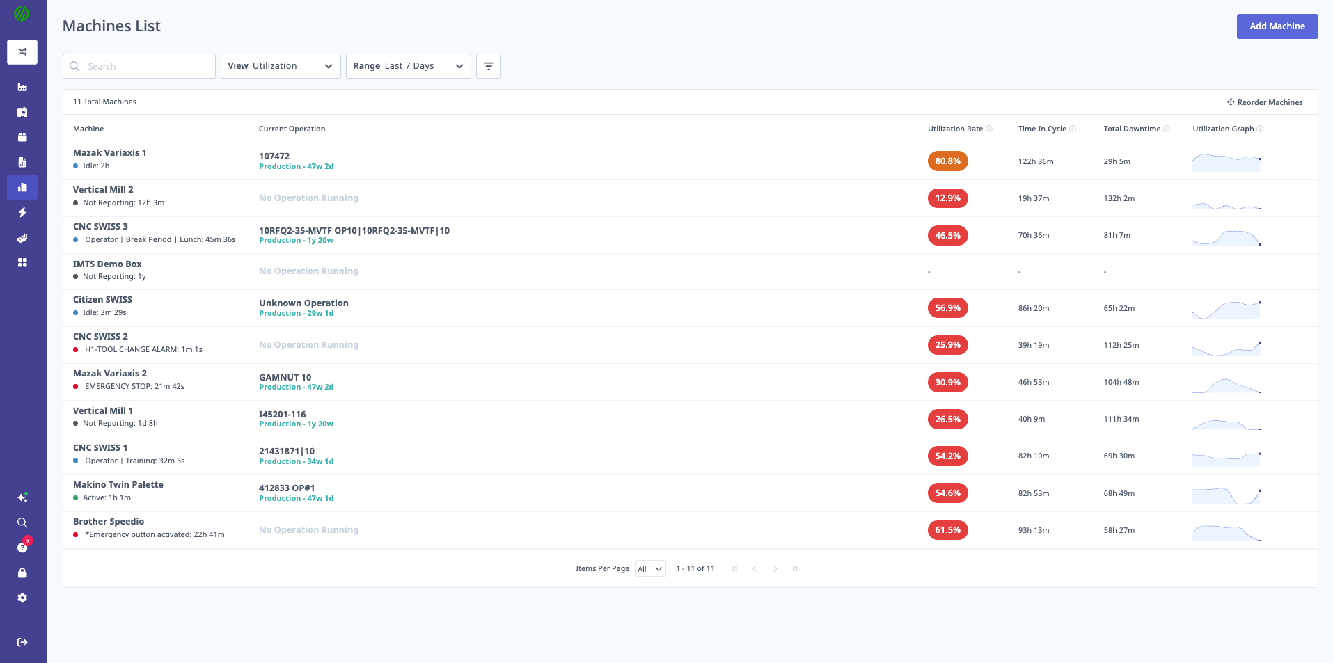
Dashboard Views
Five View Options:
1. Utilization View
- Columns: Machine, Status, Utilization %, In-Cycle Time, Active Time, Inactive Time
2. OEE View
- Columns: Machine, Status, OEE %, Availability %, Performance %, Quality %
3. Parts Goal View
- Columns: Machine, Status, Parts Goal %, Parts Produced, Parts Target, Parts Remaining
4. Settings View
- Columns: Machine, Model, Serial Number, Machine Group, Location
5. Custom View
- Choose your own columns from available metrics
Time Ranges
Available Ranges:
- Current Shift: Data for active shift
- 24 Hours: Last 24 hours
- 7 Days: Last 7 days
- 30 Days: Last 30 days
- 52 Weeks: Last 52 weeks
Selecting Time Range:
- Click time range dropdown (top)
- Select desired range
- Table updates with data for selected period
Sorting and Filtering
Sorting:
- Click any column header to sort
- Click again to reverse sort order
- Visual indicator shows current sort column and direction
Filtering:
- Search Box: Find machines by name
- Machine Group: Filter to specific groups
- Status: Filter by Active, Inactive, Disconnected
Using the Table
Machine Status Indicators:
- Green Dot: Active (currently in-cycle)
- Yellow Dot: Inactive (idle)
- Red Dot: Disconnected (no data)
- Gray Dot: No status available
Clickable Rows:
- Click any row to open machine detail view
- Opens Machines Page for that machine
- See Machines & Machine View Guide
Use Cases
For Performance Rankings:
- Sort by OEE % to find top/bottom performers
- Sort by Utilization % to find underutilized machines
- Sort by Parts Remaining to prioritize workload
For Quick Status Checks:
- Identify all disconnected machines
- Find all machines in specific group
- Check current status across entire shop
Timelines Dashboard
What is Timelines Dashboard?
Timelines Dashboard provides an interactive, visual timeline view of machine cycle status changes.
Key Features:
- Visual timeline bars showing machine states
- Color-coded states (Active, Inactive, Disconnected, Setup)
- Time scale navigation (zoom in/out)
- Downtime categorization interface
- Side-by-side machine comparison
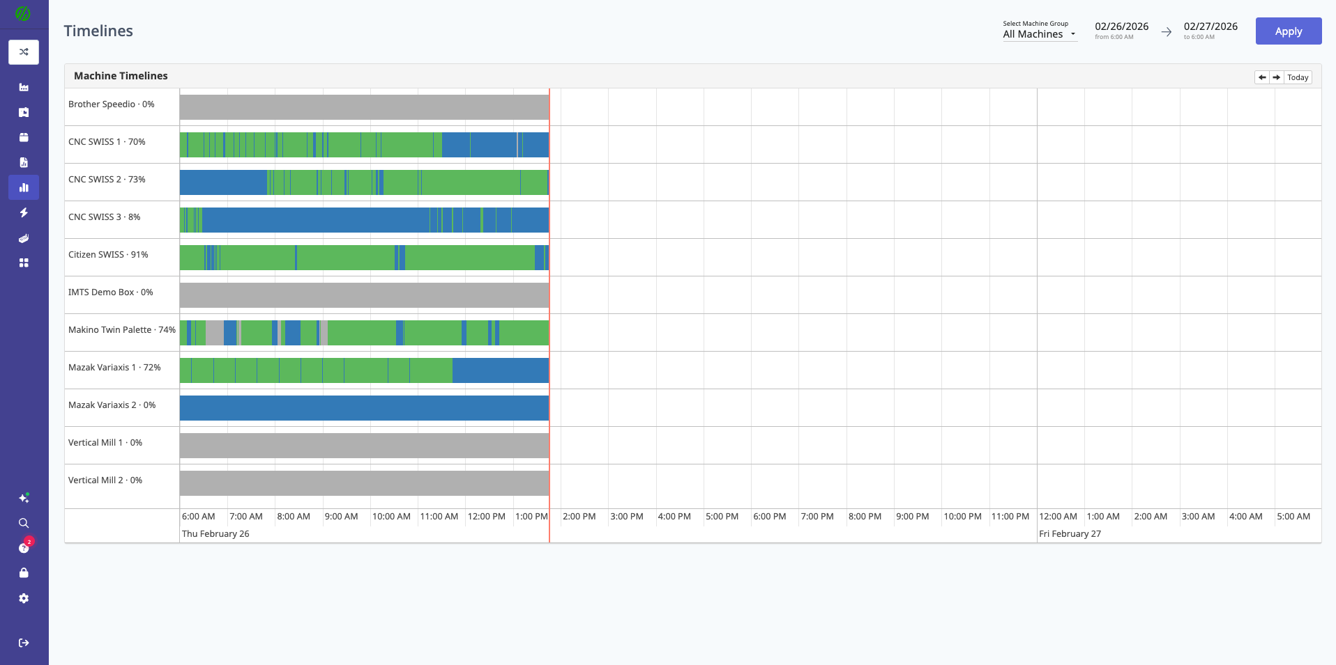
Timeline Visualization
Timeline Bars:
- Each machine has a horizontal bar
- Bar is divided into colored segments representing states
- Segment width = duration of state
State Colors:
- Green: Active (in-cycle)
- Yellow: Inactive (idle)
- Red: Disconnected (no data)
- Blue: Setup mode
- Purple: Production mode (if activity tracking enabled)
Time Scale:
- X-axis shows time (hours)
- Zoom in/out using controls
- Pan left/right to navigate timeline
Interacting with Timeline
Hovering:
- Hover over segment to see details:
- State name
- Start time
- End time
- Duration
Clicking:
- Click segment to open detail panel
- View full downtime details
- Categorize downtime (if uncategorized)
- Add notes or comments
Downtime Categorization
From Timeline:
- Click yellow (Inactive) segment
- Detail panel opens
- Select downtime category:
- Setup/Changeover
- Waiting for Material
- Waiting for Operator
- Tooling Issues
- Maintenance
- Quality Issues
- Other
- Add note (optional)
- Click Save
Benefits:
- Quick categorization of uncategorized downtime
- Visual context for downtime decisions
- See what happened before/after downtime event
Filtering
Filter Options:
- Machine Group: View specific machines
- Date Range: Select day or custom range
- Shift: Filter to specific shift
- Individual Machines: Select which machines to display
Use Cases
For Downtime Analysis:
- Identify patterns (e.g., downtime always after lunch)
- Compare downtime across machines
- Categorize historical downtime events
For Shift Handoff:
- Review what happened during previous shift
- See when machines went idle
- Understand context for current state
For Root Cause Analysis:
- Zoom in to specific time period
- See exact sequence of events
- Identify correlations (e.g., multiple machines down simultaneously)
Job Execution Dashboard
What is Job Execution Dashboard?
Job Execution Dashboard provides real-time visibility into production order progress.
Key Features:
- Color-coded machine states
- Part count progress bars
- Operator name display
- Third line customization (cycle time, job, or program)
- Optional timeline view
- Light/dark mode toggle
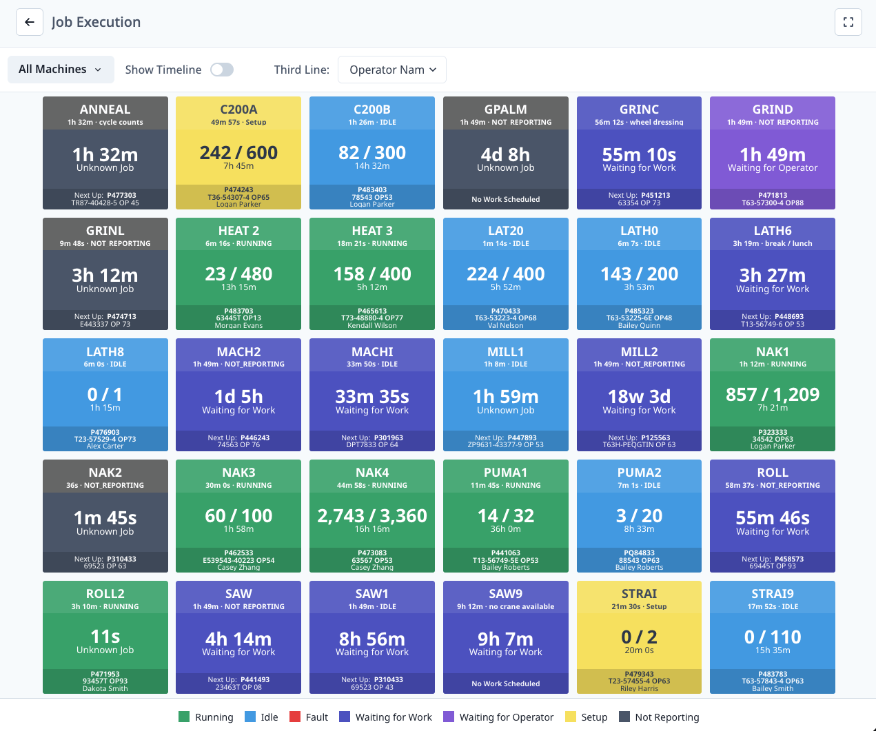
Machine States
Color Coding:
- Green: Machine active with work
- Yellow: Machine waiting (operator needed, material needed, etc.)
- Red: Machine with error or alarm
- Gray: Machine idle (no job)
- Blue: Machine in setup mode
State Icons:
- Visual icons indicate specific status (e.g., wrench for maintenance, person for operator needed)
Machine Tiles
Each Tile Shows:
- Line 1: Machine name
- Line 2: Parts produced / Parts target (progress bar)
- Line 3 (configurable):
- Cycle time
- Job/operation name
- Program name
- Operator Name (bottom)
- Status Icon (top right)
Progress Bar:
- Visual representation of parts completion
- Fills left to right as parts produced
- Color matches machine state
Configuring Display
Third Line Options:
- Click settings icon (gear)
- Select third line display:
- Cycle Time: Current cycle time vs. expected
- Job: Job or operation name
- Program: Program number or name
- Choose Show Timeline option:
- ON: Shows mini timeline below each tile
- OFF: Tiles only (more tiles fit on screen)
- Select Light Mode or Dark Mode
- Click Save
Timeline View
Mini Timelines:
- Horizontal bar below each tile
- Shows last several hours of machine states
- Color-coded (green, yellow, red, gray, blue)
- Quick visual of machine history
Use Case:
- See if machine was just started or running all shift
- Identify frequent state changes (instability)
- Compare consistency across machines
Filtering
Filter Options:
- Machine Group: View specific area
- Search: Find specific machine
Use Cases
For Production Tracking:
- Monitor progress toward production goals
- Identify which jobs are behind schedule
- Prioritize operator attention to specific machines
For Operator Coordination:
- See which operator is at which machine
- Identify machines without operators
- Balance operator workload
For Daily Standup:
- Visual backdrop for production meetings
- Quick status of all jobs
- Discussion starter for behind-schedule jobs
Daily Production Dashboard
What is Daily Production Dashboard?
Daily Production Dashboard provides real-time shop floor performance data for daily production meetings, replacing static whiteboards with live data.
Key Features:
- Shift-aware (automatically filters to current shift)
- Configurable columns (show/hide metrics)
- AI-generated summary of trends and issues
- Trend indicators (up/down arrows)
- Sortable columns
- Export to CSV
Dashboard Layout
Three Sections:
- AI Summary Tab: Insights and issues
- Trends Tab: Performance trends and anomalies
- Machine Table: Detailed metrics by machine
AI Summary Tab
Content:
- Key Insights: Top-level observations (e.g., "Utilization down 5% vs. yesterday")
- Issues Detected: Problems requiring attention (e.g., "Mill #3 has 3 uncategorized downtimes")
- Recommendations: Suggested actions (e.g., "Focus on Setup time reduction for Part ABC")
How AI Summary Works:
- Analyzes current shift data
- Compares to previous shift and historical baselines
- Identifies anomalies and patterns
- Generates plain-language summary
Use Case:
- Start daily production meeting by reading AI Summary
- Focus discussion on highlighted issues
- Prioritize actions based on recommendations
Trends Tab
Displayed Trends:
- Utilization: Up or down vs. previous shift
- OEE: Up or down vs. previous shift
- Cycle Time: Faster or slower vs. baseline
- Downtime: More or less vs. previous shift
- Scrap Rate: Up or down vs. baseline
Visual Indicators:
- ↑ Green: Positive trend (improvement)
- ↓ Red: Negative trend (decline)
- → Gray: No significant change
Use Case:
- Quickly identify areas of improvement
- Spot negative trends before they worsen
- Celebrate wins with team (positive trends)
Machine Table
Default Columns:
- Machine: Machine name
- Utilization %: In-cycle percentage
- OEE %: Overall Equipment Effectiveness
- Parts Produced: Good parts count
- Parts Goal %: Progress toward target
- Top Downtime: Most frequent downtime reason
- Operator: Current operator name
Additional Available Columns:
- Performance %
- Quality %
- Cycle Time (current vs. expected)
- Setup Time
- Scrap Count
- Touch Time
- Active Time
[machines-list-dashboard-settings-columns-1.png placeholder]
[machines-list-dashboard-settings-columns-2.png placeholder]
Configuring Columns:
- Click column selector icon (top right)
- Check/uncheck columns to show/hide
- Drag to reorder columns
- Click Save
Shift Awareness
Automatic Shift Filtering:
- Dashboard automatically detects current shift
- Filters data to show only current shift
- Updates when shift changes
Manual Shift Selection:
- Click shift dropdown
- Select different shift to review
- View historical shift data
Filtering
Filter Options:
- Machine Group: View specific department
- Date: Select day (defaults to today)
- Shift: Override automatic shift detection
- Operator: Filter to specific operator
Sorting
How to Sort:
- Click any column header
- Click again to reverse sort
- Sort indicator (arrow) shows current sort
Common Sorts:
- Sort by Utilization % (find lowest)
- Sort by OEE % (find lowest)
- Sort by Parts Goal % (find behind schedule)
- Sort by Top Downtime (find problem categories)
Use Cases
For Daily Production Meetings:
- Display on TV or projector
- Review AI Summary "Issues" tab first
- Discuss negative trends from Trends tab
- Sort table by Utilization % to find underperforming machines
- Assign action items based on top downtimes
- Export table to CSV for follow-up tracking
For Shift Handoff:
- Outgoing shift reviews dashboard with incoming shift
- Highlight ongoing issues (behind schedule jobs, quality problems)
- Transfer context (why downtime occurred, what's been tried)
For Management Walk-Through:
- Quick snapshot of shop floor status
- Identify where to focus attention
- Data-backed conversations with operators
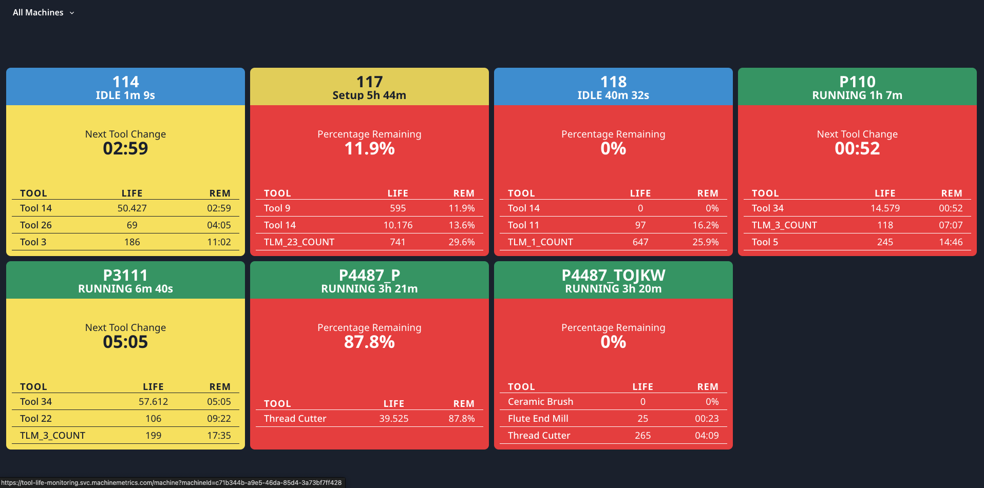
Tool Life Monitoring Dashboard
What is Tool Life Monitoring Dashboard?
Tool Life Monitoring Dashboard tracks tool life and usage to prevent tool failure and optimize tool changes.
Key Features:
- Auto mode (data from CNC) or Manual mode (MachineMetrics tracking)
- Tool life percentage display
- Alerts when tools approach end of life
- Historical tool usage data
- Configurable tool life settings
Tool Life Modes
MachineMetrics supports two methods for tracking tool life, depending on your machine capabilities:
Comparison: Auto Mode vs. Manual Mode
| Feature | Auto Mode (Mirror from CNC) | Manual Mode (MachineMetrics Counting) |
|---|---|---|
| Data Source | Machine controller | MachineMetrics calculations |
| Setup Required | None (if data available) | Tool configuration in MM |
| Accuracy | Machine's tool management | Based on cycle counts or time |
| Supported Machines | FOCAS, MTConnect, OPC-UA with tool data | Any connected machine |
| Tool List | From machine | Configured in MachineMetrics |
| Reset | Resets when machine resets | Manual reset in MM |
1. Auto Mode (Mirror from CNC)
Auto mode displays tool life data directly from the machine controller. MachineMetrics mirrors what the CNC already tracks.
Requirements:
- Machine connectivity via FOCAS, MTConnect, or OPC-UA
- Machine must report tool life data items
- Data items must be mapped in Machine Settings
How It Works:
- Machine controller tracks tool usage internally
- Tool life percentages are read via the connection
- MachineMetrics displays the data in real-time
- When tool is changed and reset on machine, MM updates automatically
Pros:
- No configuration in MachineMetrics
- Uses machine's built-in tool management
- Always matches what operator sees on machine
- Supports complex tool management (sister tools, tool groups)
Cons:
- Requires machine to support tool life tracking
- Data availability varies by controller
- Limited to what machine exposes
Supported Controllers:
- FANUC (FOCAS) — Full tool life data
- Haas — Limited tool life support
- Mazak (MTConnect) — Tool life via MTConnect
- DMG MORI — Tool life via OPC-UA
- Others — Check connectivity guide for your machine
2. Manual Mode (MachineMetrics Counting)
Manual mode uses MachineMetrics to calculate tool life based on cycle counts or active time, independent of the machine controller.
Requirements:
- Machine connected to MachineMetrics
- Part count or cycle detection configured
- Tool life settings defined in MachineMetrics
How It Works:
- Define tools and their expected life (cycles or hours)
- MachineMetrics counts cycles or tracks active time
- Tool life percentage calculated:
(Used / Total) × 100 - Alerts triggered when threshold reached
- Operator manually resets after tool change
Pros:
- Works with any connected machine
- Consistent tracking method across different machine types
- Full control over tool definitions
- Historical tracking in MachineMetrics
Cons:
- Requires manual configuration
- May not match machine's internal counting exactly
- Requires manual reset after tool changes
When to Use Manual Mode:
- Machine doesn't report tool life
- Want consistent tracking across mixed machine types
- Need custom alert thresholds
- Legacy machines without tool management features
Dashboard Display
Tool Tiles:
- Tool Name/Number: Identifier (e.g., "T1 - End Mill")
- Tool Life %: Remaining life percentage
- Status Indicator:
- Green: >25% remaining
- Yellow: 10-25% remaining
- Red: <10% remaining or expired
- Usage Data: Cycles used / Total cycles (or time used / total time)
Filtering:
- Machine: Filter to specific machine
- Machine Group: Filter to specific group
- Tool Status: Filter by Green, Yellow, or Red status
Configuring Tool Life (Manual Mode)
Setting Up Tool Life Tracking:
- Navigate to Settings → Machines → Select Machine
- Scroll to Tool Life Settings
- Click Add Tool
- Configure tool:
- Tool Name/Number: Identifier
- Tracking Method: Cycle count or Time-based
- Total Life: Total cycles or hours
- Alert Threshold: When to alert (e.g., 10% remaining)
- Click Save
Tracking Methods:
- Cycle Count: Track number of cycles tool is used
- Example: 1000 cycles per tool
- Time-Based: Track hours tool is used
- Example: 8 hours per tool
Tool Life Alerts
Alert Triggers:
- Tool reaches alert threshold (e.g., 10% remaining)
- Tool expires (0% remaining)
Alert Delivery:
- Dashboard visual indicators (red tile)
- Email notifications (if configured)
- Workflows (see Automations & Workflows Guide)
Resetting Tools
After Tool Change:
- Find tool in dashboard
- Click Reset Tool
- Confirm reset
- Tool life resets to 100%
Tracking Tool Changes:
- MachineMetrics logs tool change event
- Historical data retained
- Tool change frequency tracked in reports
Use Cases
For Preventive Maintenance:
- Replace tools before failure
- Schedule tool changes during planned downtime
- Reduce scrap from worn tools
For Tool Inventory:
- Monitor tool usage rates
- Plan tool purchases based on actual usage
- Identify fast-wearing tools (quality or speed/feed issues)
For Cost Analysis:
- Track cost per tool
- Calculate tool cost per part
- Justify premium tooling investments
Adding Tool Life to Operator Dashboards
Operators can view tool life information directly on their tablets at the machine.
Option 1: Tool Life Tab on Operator Dashboard
- Go to Settings → Operator Dashboard → Tabs
- Enable Tool Life tab
- Configure which machines to show
- Save settings
Operators see:
- List of tools for their machine
- Tool life percentage for each
- Color-coded status (Green/Yellow/Red)
- Time or cycles remaining
Option 2: Tool Life Widget on Custom Tab
- Create a custom tab on Operator Dashboard
- Add Tool Life widget via Custom URL
- Configure to show specific machine's tools
- Operators access via custom tab
Option 3: Tool Life Alerts on Operator Dashboard
- Configure workflow automation for tool life alerts
- Set trigger: Tool life below threshold
- Set action: Display message on Operator Dashboard
- Operator sees alert banner when tool needs attention
How Operators See Tool Expiry
Visual Indicators:
| Status | Color | Meaning | Operator Action |
|---|---|---|---|
| Healthy | Green | >25% life remaining | Continue running |
| Warning | Yellow | 10-25% remaining | Plan tool change |
| Critical | Red | <10% remaining | Change tool soon |
| Expired | Red (flashing) | 0% or overdue | Change immediately |
Information Displayed:
For each tool, operators see:
- Tool Number/Name: T1, T2, or custom name
- Tool Type: End Mill, Drill, Insert, etc.
- Life Remaining: Percentage and/or cycles/hours
- Status Color: Visual indicator
- Expected Expiry: "~45 parts remaining" or "~2 hours remaining"
Alert Messages:
When tools approach expiry, operators may see:
⚠️ Tool T3 (Roughing End Mill) at 15% life
   Estimated: 23 parts remaining
   [Acknowledge] [Reset Tool]
Resetting After Tool Change:
- Operator changes physical tool
- On Operator Dashboard, tap the tool tile
- Tap Reset Tool Life
- Confirm reset
- Tool life returns to 100%
Best Practices for Operators:
- Check tool life at shift start
- Plan tool changes during natural breaks
- Don't ignore yellow warnings
- Reset tools immediately after changing
- Report unexpected tool wear to supervisor
Configurable Dashboards (Custom)
What are Configurable Dashboards?
Configurable Dashboards let you create custom dashboards with selected widgets, tailored to your specific needs.
Key Features:
- Mix and match widgets
- Resize and position widgets
- Save multiple custom dashboards
- Share dashboards with team
- Schedule email delivery
Creating a Custom Dashboard
Step-by-Step:
- Navigate to Dashboards → My Dashboards
- Click Create Dashboard (top right)
- Enter Dashboard Name
- Click Add Widget
- Widget gallery opens (see Dashboard Widgets)
- Select widget type
- Configure widget settings
- Click Add
- Repeat steps 4-8 to add more widgets
- Resize and position widgets as desired
- Click Save
Managing Widgets
Resizing:
- Click and drag widget corner
- Resize to desired dimensions
- Widgets snap to grid
Repositioning:
- Click and drag widget header
- Move to desired location
- Other widgets shift automatically
Editing:
- Click widget settings icon (gear)
- Modify configuration
- Click Save
Deleting:
- Click widget delete icon (trash)
- Confirm deletion
- Widget removed from dashboard
Saving and Sharing
Saving Dashboard:
- Click Save Dashboard (top right)
- Dashboard saved to "My Dashboards"
- Accessible from Dashboards menu
Sharing with Team:
- Open dashboard
- Click Share button
- Select users to share with
- Users see dashboard in their "Shared with Me" section
Making Dashboard Public:
- Click Make Public (if IT Admin)
- Dashboard appears in company-wide dashboard list
- All users can access
Email Delivery
Scheduling Dashboard Emails:
- Open dashboard
- Click Schedule Email (top right)
- Configure schedule:
- Frequency: Daily, Weekly, Monthly
- Day/Time: When to send
- Recipients: Select users
- Click Save
Email Format:
- Screenshot of dashboard
- Link to live dashboard
- Date range covered
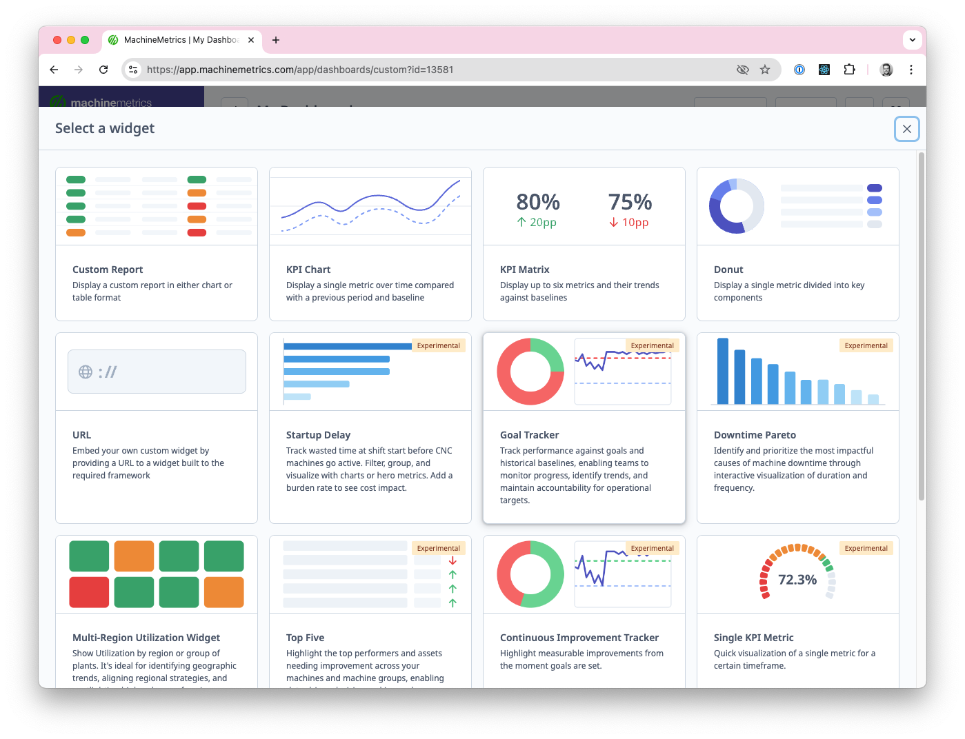
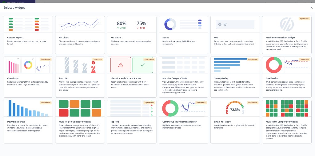
Dashboard Widgets
Overview
Widgets are individual components you add to Configurable Dashboards.
Available Widgets:
| # | Widget | Purpose |
|---|---|---|
| 1 | Multi-Plant Comparison | Compare KPIs across plants |
| 2 | Multi-Region Utilization | Regional performance view |
| 3 | Continuous Improvement Tracker | Track progress toward goals |
| 4 | Single KPI Metric | Focused single metric display |
| 5 | Top Five | Top/bottom performers ranking |
| 6 | Downtime Pareto | Downtime cause analysis |
| 7 | Goal Tracker | Performance vs. goals |
| 8 | Startup Delay | Shift start efficiency |
| 9 | Custom Report | Embed saved reports |
| 10 | KPI Report | Multi-KPI report card |
| 11 | KPI Matrix | Machines × KPIs grid |
| 12 | Donut Chart | Proportional data visualization |
| 13 | Custom URL | External content embedding |
| 14 | Chart Script | Custom coded visualizations |
| 15 | Max AI Chart | AI-generated charts |
| 16 | Tool Life | Tool status monitoring |
| 17 | Historical Alarms | Alarm history and patterns |
| 18 | Current Alarms | Active alarm monitoring |
| 19 | Machine Category Table | Grouped machine performance |
1. Multi-Plant Comparison Widget
Purpose: Compare Utilization, OEE, Availability, or Parts Goal across multiple plants or locations.

Configuration:
- Metric: Select Utilization, OEE, Availability, or Parts Goal
- Locations: Select plants to compare (requires multi-plant setup)
- Date Range: Today, Yesterday, Last 7 Days, Last 30 Days, Custom
- Thresholds: Set goal, warning, and failure percentages
- Display: Bar chart or tile grid
Use Case:
- Corporate overview of multiple plants
- Benchmark plant performance
- Identify best/worst performing locations
2. Multi-Region Utilization Widget
Purpose: Show Utilization by region or plant groups for geographic trend analysis.

Configuration:
- Regions: Define location groups (e.g., East Coast, West Coast)
- Date Range: Time period to analyze
- Thresholds: Set performance thresholds with color coding
- Display: Map view or bar chart
Use Case:
- Regional performance comparison
- Geographic expansion decisions
- Regional manager accountability
3. Continuous Improvement Tracker
Purpose: Track performance metrics vs. goals from a start date.

Configuration:
- Metric: Utilization, OEE, Availability, Quality, or Performance
- Start Date: When improvement initiative began
- Goal: Target percentage
- Machines: Filter by machine groups or individual machines
- Shifts: Filter by shift
Display:
- Line chart showing progress over time
- Goal line (horizontal)
- Current value
- Progress toward goal (percentage)
Use Case:
- Track continuous improvement initiatives
- Monitor progress toward specific goals
- Justify improvement investments (show ROI)
4. Single KPI Metric
Purpose: Focused visualization of a single metric.

Configuration:
- Metric: Select one metric (Utilization, OEE, Parts Produced, etc.)
- Display Format: Dial gauge or simple value
- Machines: Filter by machine groups or machines
- Shifts: Filter by shift
- Date Range: Time period
Display Options:
- Dial Gauge: Speedometer-style visual
- Simple Value: Large number with trend indicator
Use Case:
- Focus attention on single most important metric
- Executive dashboard (one KPI per plant)
- TV display for entire shop (e.g., plant-wide OEE)
5. Top Five
Purpose: Highlight top performers and underperforming assets.

Configuration:
- Metric: Select metric to rank by (Utilization, OEE, Parts Produced, etc.)
- Top or Bottom: Show top 5 performers or bottom 5
- Display Format: Tile grid or leaderboard
- Machines: Compare machines or machine groups
- Date Range: Time period
Display Options:
- Tile Grid: Color-coded tiles with rankings
- Leaderboard: Ranked list with values
Use Case:
- Identify best performers (recognition/best practice sharing)
- Identify worst performers (prioritize improvement efforts)
- Shift competition (leaderboard for operators)
6. Downtime Pareto
Purpose: Visualize downtime causes in Pareto chart format.

Configuration:
- Sort By: Duration or Frequency
- Machines: Filter by machine groups or machines
- Shifts: Filter by shift
- Date Range: Time period
- Include Uncategorized: Show/hide uncategorized downtime
Display:
- Pareto chart (bars + cumulative line)
- Top downtime categories
- Percentage of total downtime
Use Case:
- Identify top downtime drivers (80/20 rule)
- Prioritize improvement projects
- Track downtime reduction initiatives
7. Goal Tracker
Purpose: Monitor performance against goals and historical baselines.

Configuration:
- Metric: Utilization, OEE, Availability, Quality, or Performance
- Goal: Target percentage
- Baseline: Historical baseline to compare against
- Machines: Filter by machine groups or machines
- Shifts: Filter by shift
- Date Range: Time period
Display:
- Current value
- Goal line
- Baseline line
- Gap to goal (percentage points)
- Trend indicator
Use Case:
- Track progress toward annual goals
- Compare current vs. historical baseline
- Executive KPI tracking
8. Startup Delay
Purpose: Track wasted time at shift start before machines go active.

Configuration:
- Calculation: Average or Total startup delay
- Display: Hours or Dollars (with burden rate)
- Machines: Filter by machine groups or machines
- Shifts: Filter by shift
- Days of Week: Include/exclude weekends
- Hourly Rate: Set burden rate for dollar calculation
Display:
- Startup delay time (minutes or hours)
- Dollar value (time × burden rate)
- Comparison to previous period
Use Case:
- Identify shift start inefficiencies
- Calculate cost of late starts
- Track improvement in startup time
9. Custom Report Widget
Purpose: Embed any custom report directly into a dashboard.
Configuration:
- Report: Select from saved reports or create new
- Chart Type: Bar, Line, Pie, Table
- Date Range: Fixed or rolling (Today, Last 7 Days, etc.)
- Filters: Machine groups, shifts, operators
- Refresh Interval: How often to update data
Display:
- Chart or table visualization of report data
- Same data as running the report manually
- Click to open full report
Use Case:
- Display specific metrics not covered by other widgets
- Show report data without leaving dashboard
- Create tailored KPI views
Creating Custom Report Widget:
- Click Add Widget
- Select Custom Report
- Choose existing report or create new
- Configure display options
- Set refresh interval
- Click Add
10. KPI Report Widget
Purpose: Display a formatted report card of multiple KPIs.
Configuration:
- KPIs: Select metrics to include (Utilization, OEE, Parts, Availability, etc.)
- Layout: Horizontal or vertical arrangement
- Date Range: Time period for calculations
- Machines: Filter by groups or individual machines
- Comparison: Show vs. previous period or vs. goal
Display:
- Multiple KPI cards in single widget
- Each KPI shows current value, trend, and comparison
- Color-coded based on performance thresholds
Use Case:
- Executive summary view
- Multi-metric overview without multiple widgets
- Daily standup KPI review
11. KPI Matrix
Purpose: Compare multiple KPIs across multiple machines or groups in a grid format.
Configuration:
- Rows: Machines or machine groups
- Columns: KPI metrics (Utilization, OEE, Parts Goal, etc.)
- Date Range: Time period
- Color Coding: Set thresholds for green/yellow/red
- Sort By: Select column to sort by
Display:
- Grid/matrix showing machines × KPIs
- Color-coded cells based on performance
- Sortable columns
- Click cell to drill down
Example:
Machine     | Utilization | OEE   | Parts Goal
------------|-------------|-------|------------
Mill #1     | 78% (Green) | 72%   | 95% (Green)
Mill #2     | 65% (Yellow)| 58%   | 82% (Yellow)
Lathe #3    | 45% (Red)   | 40%   | 60% (Red)
Use Case:
- At-a-glance performance comparison
- Identify which machines need attention
- Side-by-side benchmarking
12. Donut Chart Widget
Purpose: Visualize proportional data (percentages, categories) in a donut/pie format.
Configuration:
- Data Source: Select metric or category to display
- Downtime by category
- Parts by operation
- Time by state (Active, Idle, Off)
- Machines: Filter scope
- Date Range: Time period
- Show Values: Percentages, actual values, or both
Display:
- Donut chart with center metric
- Legend with category labels
- Hover for details
- Click segment to drill down
Use Case:
- Downtime category breakdown
- Production distribution by operation
- Time allocation visualization
13. Custom URL Widget
Purpose: Embed external content or third-party dashboards within MachineMetrics.
Configuration:
- URL: Web address of external content
- Title: Widget header text
- Refresh: Auto-refresh interval (optional)
- Size: Widget dimensions
Supported Content:
- External dashboards (Power BI, Tableau, Grafana)
- Internal company pages
- Documentation or training materials
- Live camera feeds (if URL-accessible)
Limitations:
- External site must allow iframe embedding
- Some sites block cross-origin embedding
- Authentication may not pass through
Use Case:
- Integrate third-party analytics
- Display company announcements
- Show external monitoring tools
- Embed training videos
14. Chart Script Widget
Purpose: Create custom charts using scripting for advanced visualizations.
Configuration:
- Script: JavaScript-based chart definition
- Data Query: Define data to pull from MachineMetrics
- Chart Library: Built on D3.js or Chart.js
- Variables: Pass dynamic values to script
Capabilities:
- Create any chart type not available as standard widget
- Combine multiple data sources
- Custom calculations and transformations
- Advanced styling and interactivity
Example Script:
// Custom efficiency chart
const data = await query({
  metrics: ['utilization', 'oee'],
  machines: selectedMachines,
  dateRange: last7Days
});

return lineChart(data, {
  title: 'Efficiency Trend',
  colors: ['#3498db', '#2ecc71']
});
Use Case:
- Advanced analytics visualizations
- Custom metrics not in standard reports
- Integration with proprietary calculations
Note: Chart Script requires technical knowledge. Contact MachineMetrics Support for assistance.
15. Max AI Chart Insertion
Purpose: Add charts generated by Max AI directly to dashboards.
How to Add:
- Open Max AI chat
- Ask Max to generate a chart:
- "Create a downtime Pareto for last week"
- "Show me utilization trend for CNC Cell A"
- "Generate OEE comparison across all mills"
- When chart appears, click Add to Dashboard
- Select target dashboard
- Position and resize widget
- Click Save
Features:
- Charts update automatically with live data
- Same filtering options as when generated
- Click widget to regenerate with different parameters
- Ask Max to modify or recreate
Use Case:
- Quickly add custom visualizations
- Let Max AI determine best chart type
- Iterate on dashboard design with AI assistance
See the Max AI Guide for more on generating charts.
16. Tool Life Widget
Purpose: Monitor tool life status and alerts on any dashboard.
Configuration:
- Machines: Select machines to monitor
- Display Mode:
- Summary (counts by status)
- Detailed (individual tools)
- Alert Threshold: Highlight tools below threshold
- Sort By: Life remaining, machine, tool number
Display:
- Tool status indicators (Green, Yellow, Red)
- Tool life percentage remaining
- Machine and tool identification
- Time/cycles until replacement needed
Summary Mode Display:
Tool Life Status
----------------
✅ Green (>25%): 45 tools
⚠️ Yellow (10-25%): 8 tools
🔴 Red (<10%): 3 tools
Use Case:
- Preventive maintenance planning
- Tool change scheduling
- Operator awareness of upcoming changes
See the Tool Life Monitoring Dashboard for full tool tracking.
17. Historical Alarms Widget
Purpose: Display alarm history and patterns over time.
Configuration:
- Date Range: Time period to analyze
- Machines: Filter by machine groups or machines
- Alarm Types: Filter by specific alarm codes or categories
- Display: Chart or table format
- Sort By: Frequency, duration, or most recent
Display Options:
Chart View:
- Bar chart of alarm frequency by code
- Trend line of alarms over time
- Pareto of alarm durations
Table View:
| Alarm Code | Message | Count | Total Duration | Last Occurrence |
|---|---|---|---|---|
| 1234 | Spindle Overload | 15 | 2h 30m | Today 2:15 PM |
| 5678 | Coolant Low | 8 | 45m | Yesterday |
Use Case:
- Identify recurring alarm patterns
- Prioritize alarm resolution efforts
- Track alarm reduction initiatives
18. Current Alarms Widget
Purpose: Show active alarms across machines in real-time.
Configuration:
- Machines: Filter scope
- Severity Filter: Show all, critical only, or warnings only
- Display: List or tile format
- Sound Alert: Enable audible notification (optional)
Display:
- Active alarm list with machine, code, and message
- Time since alarm occurred
- Severity indicator (color-coded)
- Click to view machine details
Real-Time Updates:
- Alarms appear immediately when triggered
- Cleared alarms disappear from widget
- Count badge shows total active alarms
Use Case:
- Shop floor alarm monitoring
- Maintenance response prioritization
- Supervisor notification board
19. Machine Category Table
Purpose: Display machine performance organized by custom categories or groups.
Configuration:
- Grouping: Machine group, location, department, or custom category
- Columns: Select KPIs to display per category
- Date Range: Time period
- Aggregation: Average, sum, or weighted average
- Show Details: Expand to show individual machines
Display:
- Collapsible category rows
- KPI columns with color coding
- Expand category to see machine breakdown
- Sort by any column
Example:
Category          | Machines | Utilization | OEE   | Parts
------------------|----------|-------------|-------|-------
▼ CNC Mill Cell   | 6        | 72%         | 68%   | 1,245
  └ Mill #1       |          | 78%         | 75%   | 234
  └ Mill #2       |          | 65%         | 62%   | 198
  └ ...           |          |             |       |
▶ Lathe Cell      | 4        | 68%         | 64%   | 890
▶ EDM Department  | 2        | 82%         | 78%   | 156
Use Case:
- Department-level performance overview
- Compare production cells
- Drill down from category to machine
Sharing Dashboards
TV Dashboard Setup
Purpose: Display dashboards on TV screens throughout shop floor.
Step-by-Step:
-
Create Kiosk Account:
- Navigate to Settings → Users
- Click Add User
- Name: "Shop Floor TV" or similar
- Role: Viewer or Supervisor
- Email: shopfloortv@yourcompany.com (functional email)
- Password: Set secure password
- Click Save
-
Set Up TV or Windows PC:
- Connect TV/PC to network
- Open web browser (Chrome recommended)
- Navigate to app.machinemetrics.com
-
Login with Kiosk Account:
- Enter kiosk account email
- Enter password
- Login
-
Select Dashboard:
- Navigate to desired dashboard
- Example: Current Shift Dashboard, Daily Production Dashboard
-
Enable Full Screen:
- Dashboard Full Screen: Click expand arrows icon (if available)
- Browser Full Screen: Press F11 (Windows) or Cmd+Shift+F (Mac)
-
Disable Sleep Settings:
- TV: Disable auto-sleep in TV settings menu
- Windows PC: Settings → System → Power → Never sleep
- Mac: System Preferences → Energy Saver → Prevent computer from sleeping
Best Practices:
- Place TV where visible to operators and managers
- Use large screen (40"+ recommended)
- Refresh page daily to ensure latest version loads
- Use wired ethernet connection (more reliable than WiFi)
Tablet Display
Purpose: Display dashboards on tablets at machines or in work areas.
Using Tablets:
- Tablets provisioned with MachineMetrics PWA (Progressive Web App)
- Operators can view dashboards
- Supports touch interaction
Recommended Dashboards for Tablets:
- Job Execution Dashboard (production order progress)
- Current Shift Dashboard (machine status)
- Tool Life Monitoring Dashboard (tool status)
Tablet Setup:
Email Sharing
Scheduled Dashboard Emails:
- See Email Delivery in Configurable Dashboards section
- Automatically send dashboard snapshots
- Include live links
Custom URL Widgets
Adding External Dashboards: If you have external dashboards (e.g., Tool Life Monitoring from another system):
- Open Configurable Dashboard
- Click Add Widget
- Select Custom URL
- Paste URL of external dashboard
- Configure size and position
- Click Save
Use Case:
- Integrate third-party dashboards
- Combine MachineMetrics and other systems
- Create unified view
Best Practices
Dashboard Selection
Choose the Right Dashboard for the Use Case:
| Use Case | Recommended Dashboard |
|---|---|
| Real-time shift monitoring | Current Shift Dashboard |
| Daily production meeting | Daily Production Dashboard |
| Shift performance comparison | Performance Dashboard |
| Downtime root cause analysis | Timelines Dashboard |
| Production order tracking | Job Execution Dashboard |
| Performance benchmarking | Configurable Dashboard with Top Five widget |
| Continuous improvement tracking | Configurable Dashboard with CI Tracker widget |
| TV display for shop floor | Current Shift or Daily Production Dashboard |
Daily Production Meeting Best Practices
Meeting Structure (15 minutes):
- AI Summary Review (2 min):
- Read key insights
- Highlight critical issues
- Trends Discussion (3 min):
- Review trend indicators
- Identify positive trends (celebrate)
- Focus on negative trends (why?)
- Machine Table Review (5 min):
- Sort by Utilization % (lowest first)
- Discuss underperforming machines
- Identify top downtime categories
- Action Items (5 min):
- Assign owners for issues
- Set deadlines
- Document follow-up items
Tips:
- Keep meeting focused (don't deep-dive during meeting)
- Use dashboard as discussion guide, not script
- Assign follow-up investigations for complex issues
- Track action items week-over-week (accountability)
TV Display Best Practices
Placement:
- Visible from operator stations
- Near manager desk or meeting area
- At shop floor entrance (visible to visitors)
Dashboard Selection:
- Shop Floor: Current Shift Dashboard (real-time status)
- Manager Office: Daily Production Dashboard or Performance Dashboard
- Conference Room: Configurable Dashboard with executive metrics
Refresh Schedule:
- Dashboards update in real-time (no manual refresh needed)
- Refresh browser daily (clears cache)
- Reboot TV/PC weekly (prevents memory issues)
Custom Dashboard Best Practices
Widget Selection:
- Limit to 4-6 widgets per dashboard (readability)
- Group related metrics (e.g., all OEE-related widgets together)
- Use consistent time ranges across widgets
Layout:
- Most important widget = top left (eye naturally goes there)
- Larger widgets for primary metrics
- Smaller widgets for supporting data
Naming:
- Descriptive names: "Production Meeting Dashboard", "Executive Summary"
- Include frequency if recurring use: "Weekly Review Dashboard"
Sharing:
- Make Public for standardized dashboards (e.g., daily production meeting)
- Keep Private for personal tracking dashboards
- Schedule emails for remote stakeholders (executives, customers)
Data Quality for Dashboards
To Ensure Accurate Dashboards:
1. Machine Connectivity
- Verify all machines connected
- Check for disconnected machines daily
- Investigate connection issues promptly
2. Downtime Categorization
- Train operators to categorize downtime
- Review uncategorized downtime weekly
- Use Timelines Dashboard for quick categorization
3. Production Run Tracking
- Ensure operators start/stop operations
- Enable APM where possible
- Audit production runs regularly
4. Operator Logins
- Train operators to log in at shift start
- Audit operator data (check for missed logins)
- Use Operator Runs to correct mistakes
5. Shifts and Scheduled Time
- Configure shifts correctly
- Mark planned downtimes
- See Understanding Your Data Guide
Getting Help
Common Questions
"Dashboard shows no data"
- Check date range (is it in the future?)
- Verify machines are connected (check Machines List)
- Confirm shifts are configured (Settings → Shifts)
- Check filters (are all machines filtered out?)
"Machine tiles are gray on Current Shift Dashboard"
- Machine disconnected (check machine connectivity)
- No scheduled time configured (check shift settings)
- Machine has not been active recently
"Widget won't add to Custom Dashboard"
- Browser compatibility (use Chrome or Edge)
- Clear browser cache
- Try smaller widget size first
- Contact support if issue persists
"TV display goes to sleep"
- Disable TV auto-sleep in TV settings menu
- Disable computer sleep in OS settings
- Use wired connection (more reliable than WiFi)
"Dashboard not updating in real-time"
- Refresh browser page (F5 or Cmd+R)
- Check internet connection
- Clear browser cache
- Verify machine is sending data (check machine page)
Before Contacting Support
Gather Information:
- Dashboard type (Current Shift, Daily Production, etc.)
- Which machines affected
- Screenshot of issue
- Browser type and version
- Steps to reproduce
Try These Steps:
- Refresh page (F5 or Cmd+R)
- Clear browser cache and reload
- Try different browser (Chrome recommended)
- Check machine connectivity (Machines List Dashboard)
- Verify filters (ensure not accidentally filtering out data)
Contact Support
MachineMetrics Support:
- Email: support@machinemetrics.com
- Include:
- Dashboard type
- Screenshot of issue
- Machines/groups affected
- Expected behavior vs. actual behavior
- Browser type and version
For Training:
- Request dashboard setup training
- Ask about custom dashboard best practices
- Schedule TV dashboard setup assistance
- Request Daily Production Dashboard workshop
Next Steps:
- Explore all dashboard types: Dashboard Types
- Create your first custom dashboard: Configurable Dashboards
- Set up TV dashboard for shop floor: TV Dashboard Setup
- Review performance metrics: Understanding Your Data Guide
Questions? Contact support@machinemetrics.com