Company Dashboard Guide
Overview
What is the Company Dashboard?
The Company Dashboard is your central hub for monitoring overall manufacturing performance across your entire operation. It provides high-level insights into key metrics, identifies performance issues, and helps you understand trends over time.
Key Capabilities:
- Track utilization, OEE, availability, and performance
- Monitor production volume (good parts, scrap, non-conforming)
- View live machine status across the shop floor
- Identify downtime patterns
- Spot machines performing below baseline
- Detect operations with slower-than-expected cycle times
Who Uses This:
- Executives: High-level performance overview
- Managers: Department and shift analysis
- Continuous improvement teams: Trend identification
- Operations leadership: Daily status monitoring
Accessing the Company Dashboard
Navigation:
- Log into MachineMetrics at app.machinemetrics.com
- Click Company in the main navigation menu
- Dashboard loads with default view (typically "Today")
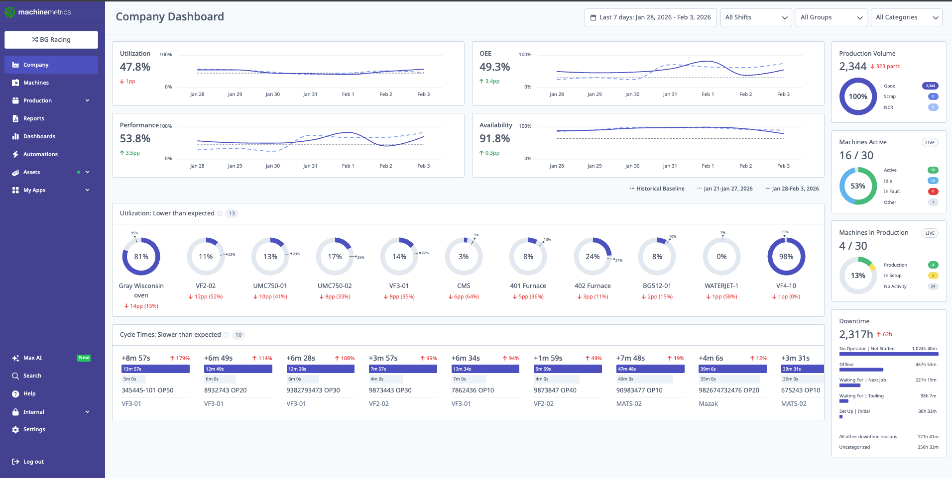
The Company Dashboard provides a comprehensive view of your entire operation, including utilization, OEE, performance, availability, production volume, machines active, machines in production, downtime analysis, and cycle time tracking.
Default View:
- Shows current day's performance
- Compares to previous period
- Displays live machine status
Dashboard Controls
Date Range Selector
Available Date Ranges:
- Today: Current 24-hour shop day
- Yesterday: Previous 24-hour shop day
- Last 7 Days: Rolling 7-day window
- Week to Date: Current week from start
- Last Week: Previous complete week
- Month to Date: Current month from start
- Last Month: Previous complete month
- Custom Range: Select specific start and end dates
Selecting a Date Range:
- Click date range selector (top of dashboard)
- Choose preset or select Custom Range
- If custom: Pick start date and end date
- Click Apply
- Dashboard updates with new data
Shift Filter
Purpose: Filter all metrics to specific shifts.
Using Shift Filter:
- Click Shift dropdown
- Select one or more shifts:
- First Shift
- Second Shift
- Third Shift
- Weekend
- (Or your custom shift names)
- Dashboard filters to selected shifts only
Impact:
- All widgets filter to selected shifts
- Baseline calculations adjust to shift data
- Useful for comparing shift performance
Machine Groups Filter
Purpose: Focus on specific departments or machine types.
Using Machine Groups:
- Click Machine Groups dropdown
- Select one or more groups:
- All Machines (default)
- By department (e.g., CNC, Lathes, Mills)
- By production line
- By machine type
- Dashboard shows selected groups only
Impact:
- Narrows focus to relevant machines
- Baseline adjusts to group-specific data
- Compare groups side-by-side by switching filters
Tip: Use combination of shift + machine group filters for deep analysis (e.g., "How does the Lathe department perform on second shift?")
Main KPI Metrics
Metric Cards Overview
The dashboard displays four primary KPI cards at the top:
- Utilization
- OEE (Overall Equipment Effectiveness)
- Availability
- Performance
Each card shows:
- Current Value: Metric for selected date range
- Variance from Baseline: Percentage point difference from 6-month median
- Comparison to Previous Period: Change from last period (e.g., previous week)
- Visual Indicator:
- 🟢 Green up arrow = improvement
- 🔴 Red down arrow = decline
- ⚪ Gray = no significant change
Utilization
Definition: Percentage of scheduled time that machines are actively producing.
Formula:
Utilization = (Active Time / Scheduled Time) × 100%
What This Tells You:
- How effectively you're using available production time
- Impact of downtime on overall productivity
- Whether machines are idle during scheduled hours
Example:
- Current: 75%
- Baseline: 80%
- Variance: -5 pp (5 percentage points below typical)
- vs Previous Week: -2%
Interpretation: Utilization is down 5 points from historical average and dropped 2% from last week. Investigate causes of increased downtime or idle time.
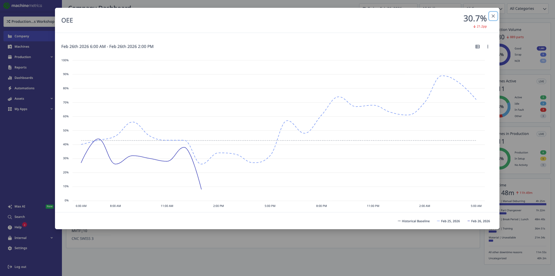
OEE (Overall Equipment Effectiveness)
Definition: Composite metric combining availability, performance, and quality.
Formula:
OEE = Availability × Performance × Quality
What This Tells You:
- Overall manufacturing efficiency
- Combined impact of downtime, speed losses, and quality issues
- Industry benchmark comparison (world-class OEE ≥ 85%)
Example:
- Current: 68%
- Baseline: 72%
- Variance: -4 pp
- vs Previous Week: -1%
Interpretation: OEE declined slightly. Drill into Availability, Performance, and Quality widgets to identify root cause.
Availability
Definition: Percentage of planned production time that equipment is available to operate.
Formula:
Availability = (Operating Time / Planned Production Time) × 100%
What This Tells You:
- Impact of unplanned downtime
- Equipment reliability
- Maintenance effectiveness
Example:
- Current: 92%
- Baseline: 94%
- Variance: -2 pp
- vs Previous Week: +1%
Interpretation: Availability slightly below baseline but improving from last week. Monitor for sustained improvement.
Performance
Definition: Ratio of actual production speed to ideal/target speed.
Formula:
Performance = (Actual Cycle Time / Ideal Cycle Time) × 100%
What This Tells You:
- Whether machines are running at expected speed
- Impact of minor stoppages and reduced speed
- Process efficiency
Example:
- Current: 85%
- Baseline: 87%
- Variance: -2 pp
- vs Previous Week: 0%
Interpretation: Performance 2 points below baseline, stable vs last week. Check for cycle time increases in specific operations.
Production Volume Widget
Overview
The Production Volume widget displays total parts produced during the selected time range, broken down by quality.
Displayed Metrics:
- Total Parts: All parts produced
- Good Parts: Parts that passed quality checks
- Scrap: Parts rejected/discarded
- Non-Conforming: Parts that don't meet specifications (rework candidates)
Visual Display:
- Large number showing total parts
- Percentage change vs previous period
- Stacked bar or pie chart showing breakdown
- Variance from baseline (if available)
Understanding Production Volume
Example:
Total Parts: 1,247 (+8% vs previous week)
├─ Good: 1,180 (94.6%)
├─ Scrap: 45 (3.6%)
└─ Non-Conforming: 22 (1.8%)
What This Tells You:
- Overall production output
- Quality performance (scrap/non-conforming rates)
- Week-over-week production trends
- Whether quality issues are increasing
Action Items:
- High scrap rate → Investigate quality issues
- Declining total → Check for downtime or speed losses
- Non-conforming increase → Review tolerances or inspection
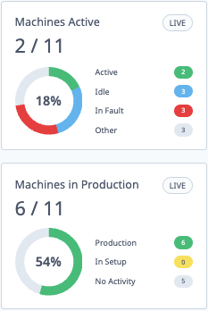
Live Machine Status Wheels
Machines Active Wheel
Purpose: Real-time breakdown of machines by execution state.
Categories:
- Active (Green): Machine is currently cutting/processing
- Idle (Yellow): Machine is powered on but not in cycle
- Off (Gray): Machine is powered off or disconnected
- Unknown (Dark Gray): Status cannot be determined
Display:
- Donut chart with count in each category
- Percentage of total machines
- Updates in real-time (every few seconds)
Use Cases:
- Quick floor status check
- Identify idle machines for operator assignment
- Verify machine connectivity
- Monitor shift start-up (all machines coming online)
Example:
Total Machines: 24
├─ Active: 18 (75%)
├─ Idle: 4 (17%)
├─ Off: 1 (4%)
└─ Unknown: 1 (4%)
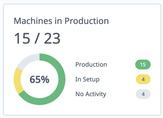
Machines in Production Wheel
Purpose: Real-time breakdown by production status (vs execution state).
Categories:
- In Production (Green): Active operation assigned and running
- Ready: Machine ready but no operation started
- Interrupted: Operation paused or stopped
- No Operation: No operation assigned
Display:
- Donut chart with count in each category
- Percentage of total
- Real-time updates
Difference from Active Wheel:
- Active wheel = physical machine state (cutting or not)
- Production wheel = operational state (job/operation status)
- Machine can be "Active" but "No Operation" if cutting air or test running
Use Cases:
- Verify operations are properly assigned
- Identify machines waiting for work
- Track interrupted operations needing attention
- Monitor production start-up process
Example:
Total Machines: 24
├─ In Production: 16 (67%)
├─ Ready: 5 (21%)
├─ Interrupted: 2 (8%)
└─ No Operation: 1 (4%)
Top 5 Downtime Pareto
Overview
The Top 5 Downtime Pareto widget displays the most common downtime reasons during the selected time range.
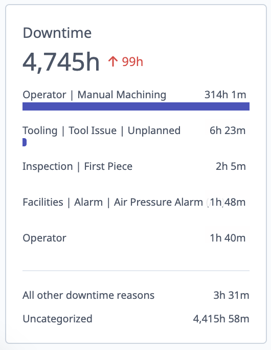
Display:
- Horizontal bar chart
- Top 5 downtime categories by duration
- "All Other" rollup for remaining categories
- "Uncategorized" for unclassified downtime
- Total downtime hours for each category
Example:
1. Setup/Changeover         45.2 hrs  ████████████████░░░░
2. Waiting for Material     32.1 hrs  ██████████████░░░░░░
3. Tooling Issues           28.5 hrs  ████████████░░░░░░░░
4. Maintenance              22.3 hrs  ██████████░░░░░░░░░░
5. Operator Breaks          18.7 hrs  █████████░░░░░░░░░░░
   All Other                35.4 hrs  ██████████████░░░░░░
   Uncategorized            12.8 hrs  ██████░░░░░░░░░░░░░░
Understanding Downtime Data
Total Downtime Includes:
- Planned downtime (breaks, PM, changeovers)
- Unplanned downtime (breakdowns, waiting)
- Micro-events (< configured threshold)
- Long events (> configured threshold)
Key Insights:
- Which issues consume most production time
- Whether downtime is planned or unplanned
- Recurring vs one-time issues
- Opportunities for improvement
Actions:
- High setup time → Implement SMED (Single-Minute Exchange of Dies)
- Waiting for material → Improve material flow/logistics
- Tooling issues → Review tool management process
- High uncategorized → Improve classification training
Accessing Downtime Report
Quick Access:
- Click "View Report" link at top of widget
- Opens full Downtime Report filtered to current date range
- Drill into specific categories for detailed analysis
Performance Alerts
Utilization: Lower than Expected
Purpose: Automatically identify machines performing below their historical baseline.
What It Shows:
- Machines with median utilization below 6-month baseline
- Sorted by highest variance (worst performers first)
- Only includes machines with "first active time" set
Display Format:
Machine Name          Current    Baseline    Variance
Mill #3               68%        78%         -10 pp
Lathe #7              71%        79%         -8 pp
VMC #12               75%        82%         -7 pp
How to Use:
- Review machines in list
- Click machine name → opens machine snapshot
- View timeline, recent downtime, and trends
- Click "Go to machine" → machine overview page
- Investigate root causes (downtime categories, cycle time issues, etc.)
Common Causes:
- Increased downtime frequency
- Longer downtime events
- Reduced production speed
- Shift changes affecting performance
- New operators learning curve
Note: Machines without "first active time" configured are excluded from this widget. Set first active time in machine settings for accurate baseline calculation.
Cycle Times: Slower than Expected
Purpose: Identify operations running slower than their historical baseline cycle time.
What It Shows:
- Operations with median cycle time above 3-month baseline
- Sorted by highest variance (slowest first)
- Limited to selected time period (typically < 1 week)
Display Format:
Operation                Machine    Current    Baseline    Variance
Part #1234-A             Mill #3    125s       110s        +15s (13.6%)
Housing Rough            Lathe #7   98s        85s         +13s (15.3%)
Cover Finish             VMC #12    76s        70s         +6s (8.6%)
How to Use:
- Review operations in list
- Click operation → opens operation details
- View cycle time history, trending, and recent runs
- Compare to ideal/target cycle time
- Investigate causes (tool wear, process changes, etc.)
Common Causes:
- Tool wear (need replacement)
- Feed rate or spindle speed reduction
- Program changes
- Material hardness variation
- Machine performance degradation
Actions:
- Tool wear → Schedule tool changes
- Process drift → Review and optimize program
- Material variation → Check material specs
- Equipment issue → Schedule maintenance
Understanding Baselines
What is a Baseline?
A baseline is a historical reference point representing typical performance over a defined period. MachineMetrics uses baselines to:
- Compare current performance to historical norms
- Detect performance degradation or improvement
- Set expectations for machine/operation performance
- Identify outliers
Company Dashboard Baselines
Calculation Method:
- Lookback Period: 6 months of historical data
- Calculation: Median value per week
- Result: Median of weekly medians = baseline
Metrics with Baselines:
- Utilization
- OEE
- Availability
- Performance
- Production Volume (in some views)
Example Calculation:
Week 1: 78% utilization
Week 2: 82% utilization
Week 3: 75% utilization
...
Week 26: 80% utilization

Baseline = Median of all weekly values = 79%
Why Median (not Average)?
- Median is more robust to outliers
- Extreme good/bad weeks don't skew baseline
- Represents "typical" performance better
- Less sensitive to seasonal variations
Variance from Baseline
Displayed As:
- Percentage points (pp) for percentage-based metrics
- Absolute values for counts/durations
- Color-coded indicators (green/red/gray)
Interpreting Variance:
- Positive variance (green): Current > baseline (good for utilization, OEE, parts)
- Negative variance (red): Current < baseline (needs investigation)
- No significant variance (gray): Within normal range
Example:
Current Utilization: 75%
Baseline: 80%
Variance: -5 pp

Interpretation: Utilization is 5 percentage points below typical performance
Machines Page Baselines
Different Calculation for Cycle Times:
- Lookback Period: 3 months (vs 6 for company dashboard)
- Applied To: Individual operations
- Purpose: Detect process drift at operation level
Why 3 Months?
- Operations change more frequently than company-wide metrics
- Shorter window captures recent process improvements
- More responsive to process changes
Comparison Periods and Trends
How Comparison Works
Comparison Logic: MachineMetrics compares current period data to the immediately preceding period of equal length.
Examples:
- Today → compares to previous 24-hour shop day (yesterday)
- Last 7 Days → compares to prior 7 days (days 8-14 ago)
- Week to Date → compares to previous week
- Month to Date → compares to previous month
Displayed As:
- Percentage change (e.g., "+5%" or "-3%")
- Arrow indicator (up = increase, down = decrease)
- Color (green for improvement, red for decline)
Trend Indicators
Understanding Trends:
Utilization: 78% ↑ +3% vs Previous Week
├─ Current period: 78%
├─ Previous period: 75.7%
└─ Change: +2.3 pp = +3% increase
Interpretation:
- ↑ +% (green) = Metric improved
- ↓ -% (red) = Metric declined
- ⟷ ±0% (gray) = No significant change
What Metrics Show Trends:
- All main KPI cards (Utilization, OEE, Availability, Performance)
- Production Volume
- Downtime totals
Use Cases:
- Track week-over-week improvement
- Identify sudden drops requiring immediate attention
- Validate continuous improvement efforts
- Communicate progress to stakeholders
Best Practices
Daily Review Routine
Morning Review:
- Open Company Dashboard
- Set date range to "Today"
- Check live status wheels:
- Are machines starting up properly?
- Any unexpected "Off" or "Unknown" machines?
- Review yesterday's performance:
- Set to "Yesterday"
- Check main KPIs vs baseline
- Note any significant variances
- Review "Utilization: Lower than expected"
- Identify machines needing attention
- Assign follow-up tasks
Weekly Review (30 minutes):
- Set date range to "Last 7 Days"
- Compare to previous week
- Review Top 5 Downtime Pareto:
- Are top reasons consistent?
- Any new issues emerging?
- Check "Cycle Times: Slower than expected"
- Schedule tool changes or process reviews
- Filter by machine groups:
- Compare department performance
- Identify best practices to share
- Filter by shifts:
- Compare shift performance
- Address shift-specific issues
Filter Strategies
Department Analysis:
- Select single machine group (e.g., "CNC Mills")
- Review all KPIs for that group
- Compare to company baseline
- Identify group-specific improvement opportunities
- Repeat for each department
Shift Comparison:
- Set date range (e.g., "Last 7 Days")
- Select "First Shift" only
- Note all KPI values
- Switch to "Second Shift"
- Compare metrics
- Investigate differences (training, staffing, etc.)
Targeted Analysis:
Example: "Why is second shift lathe performance low?"
1. Machine Groups → Lathes
2. Shifts → Second Shift
3. Date Range → Last 7 Days
4. Review KPIs and downtime
5. Click underperforming machines
6. Drill into timeline for root causes
Setting Expectations
Baseline Interpretation:
- Baseline = typical performance, not target
- Being below baseline doesn't mean failure
- Focus on trends more than absolute values
- Baseline adjusts over time as performance improves
Realistic Goals:
- Short term: Return to baseline (if below)
- Medium term: Exceed baseline by 5-10%
- Long term: Continuous improvement, baseline rises
Communicating Results:
- Use variance from baseline to show progress
- Highlight positive trends (even if below baseline)
- Provide context for declines (e.g., major maintenance, new products)
- Celebrate improvements in specific areas
Getting Help
Before Contacting Support
Verify:
- Date range is correct
- Shift/machine group filters are set as intended
- Machines have "first active time" configured (for baseline calculations)
- Data is appearing for selected time range (not blank widgets)
Check:
- Machine connectivity (green status in Machines page)
- Recent system updates or changes
- Whether issue affects all machines or specific ones
Contact Options
MachineMetrics Support:
- Email: support@machinemetrics.com
- Include:
- Screenshot of Company Dashboard
- Date range and filters applied
- Specific question or issue
- What you expected vs what you're seeing
For Training:
- Request dashboard walkthrough session
- Ask about best practices for your industry
- Schedule advanced analytics training
Next Steps:
- Explore the Machines & Machine View Guide for detailed machine analysis
- Learn about Understanding Your Data for OEE/OOE/TEEP deep dive
- Review Downtime & Quality Guide for classification strategies
Questions? Contact support@machinemetrics.com